Feb 27 2019
Analysis of Oscar TV Viewership | Mark Graban | LinkedIn
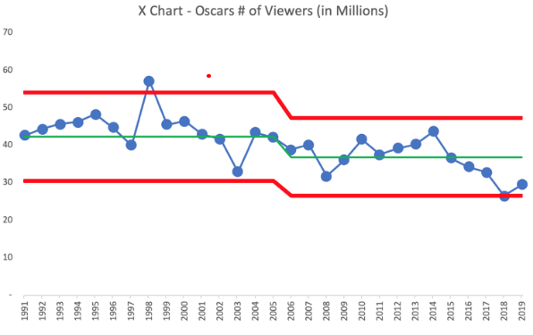
“Initial analysis says Oscars TV viewers and ratings are up over 2018. But, for context, the ratings were DOWN in 2018 compared to 2017.
Instead of reacting to each new data point, look at trends over time using “run charts” or “process behavior charts” (as I created). Did having “no host” make any statistically significant difference in ratings? No. The numbers are just fluctuating. Don’t waste time cooking up an explanation for ‘noise’ in a metric.”
Source: LinkedIn
Michel Baudin‘s comments: What happened between 2004 and 2005? Visually, the downward step is the one feature of the chart that stands out. If the technique Mark used is valid, there should be assignable causes from that period to explain the drop. If you forget the green and red lines and just look at the time series, however, a smooth, long-term downward trend sounds like a better fit. Perhaps Mark should try more modern trend analysis tools besides the venerable XmR chart.
Following a day of spirited discussion, Mark sent me the data and asked for my own analysis, which is in the chart below. The gray band is a 99% confidence interval, calculated without any knowledge of the nature of the numbers. The points outside the band can be assumed to have assignable causes for their unusual high or low ratings, and I took a look at the press reports on a few. As you can see, there is nothing special happening in 2004-2005. 
The popularity of a show has nothing to do with a critical dimension on a manufactured part, which is supposed to be constant. The plant organization has the authority to do what it takes to keep it that way. There is no reason why show ratings should be constant.
In addition, while a length measurement qualifies as a raw data point, the published number of viewers of a TV show doesn’t. In the US, it is an estimate based on a poll of 5,000 households. Viewership of the Oscars ceremony in 2019 was 11.5% higher than in 2018. On 5,000 data points, it does not look like a fluctuation. By comparison, political polls use samples of 1,000 to 1,500 voters and claim margins of error of ±3%.
The viewership estimates aren’t just numbers in a table, and you can’t interpret them properly without knowing their backstory.
 “Six Sigma as a problem-solving methodology causes many hang-ups for Japanese managers. Many Americans seeking training in Six Sigma in Japanese organizations face resistance with little explanation as to why. This often leads to frustration and contempt towards management. They write off the Japanese resistance to the training as resistance to change, preventing growth and feeling unrepresented.
Mar 2 2019
The Math Behind The Process Behavior Chart
Ever since asking Is SPC Obsolete? on this blog almost 6 years ago, multiple sources have told me that the XmR chart is a wonderful and currently useful process behavior chart, universally applicable, a data analysis panacea, requiring no assumption on the structure of the monitored variables. So I dug into it and this what I found.
Contents
Share this:
Like this:
By Michel Baudin • Data science 45 • Tags: Process Behavior Chart, SPC, XmR Chart