Jul 23 2013
Standard Work in Low-Volume/High-Mix Manufacturing
In the TPS Principles and Practices discussion group on LinkedIn, Brian Miller initiated a discussion on “How do you create standard work for a customized product that has over a billion combinations?” It has had 31 comments so far, and I would like to share here a few that I made.
Even in a plant that is perceived to be focused on low-volume/high-mix production, you usually have an uneven demand pattern, calling for different approaches to standard work by product category.
You start with a Runner/Repeater/Stranger analysis to determine what it is we do often and what not. Without this analysis, we commingle in the same lines products made every day with other products made sporadically (See Lean Assembly). In Japan, this is called P-Q, or Product-Quantity analysis, with the categories called A, B and C. The more vivid Runner/Repeater/Stranger terminology comes from Lucas Industries in the UK. You then use a dedicated, integrated production line for each Runners, a flexible line for each family of Repeaters, and a job-shop with functional groupings of equipment for Strangers.
Then, obviously, you face different challenges for developing standard work in each category:
- In a runner line, you can post A3 sheets above each workstations with instructions for the purpose of allowing supervisors to monitor how the work is being done. This is the normal situation of high-volume production.The operators themselves do not need to read the instructions for every workpiece; as soon as they are proficient in the job, they work from memory.

- A repeater line is for a family of products with variants but with a high commonality of materials and processes. The instructions that can be posted on A3 sheets are then limited to the common processes, but the operator needs to read what is specific to each workpiece. For final assembly of cars, Toyota has provided “build manifests” printed on larger sheets mounted on car bodies and bearing all the option information. The kitting of workpiece-specific components also helps. In computer assembly, workpiece specifics are shown on electronic displays, with component picks validated by auto-ID technology, including bar codes, QR-codes, or RFID chips.


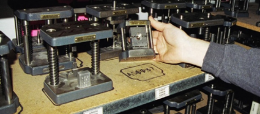
Kit trays with instructions for repeaters in electronics assembly - Strangers are the odds and ends with sporadic demand, one-of-a-kind systems, or new product prototypes. For strangers, you cannot rely on operator memory or habit. For one-of-a-kind systems or prototypes, you cannot even assume you have the knowledge needed to produce workable detailed instructions. Each stranger is a job in a job shop and requires instructions on a traveller that moves with the workpiece. The traveller may be hardcopy or electronic. An electronic traveller may either be a device containing all the instructions or an ID that triggers the download of appropriate instructions at each station. Strangers are usually built by skilled craftsmen able to work directly from engineering drawings. Given the nature of strangers, however, the time required cannot be precisely known and sequencing mistakes will happen, making rework inevitable.


Sep 17 2013
What is Karakuri Kaizen?
Google “Karakuri Kaizen,” and you see a small number of Youtube videos from Japan, Thailand, Italy, and Hong Kong showcasing materials handling devices that rely on gravity, levers, cams and inertia to move bins in elaborate ways, transfer parts between machines, or deliver a controlled number of small parts to an operator’s hand.
Here is one from Japan’s JMAC with multiple examples:
Such devices have long been used as part of TPS and Lean, but now we have a generic name for them. The principles of Karakuri Kaizen given at the end of this video are as follows:
While “Karakuri Kaizen” is an alliteration that rolls of the tongue almost as easily as “cash for clunkers” or “toys for tots,” you may still wonder where “Karakuri” comes from and what it means. Until “Karakuri Kaizen,” I had never heard it stand-alone but always as part of “Karakuri Ningyo,” or Karakuri Dolls, which are wind-up automata with wooden gears and levers developed at toys in 18th-century Japan. The best known are tea-serving dolls, like the one in the featured image.
As Karakuri dolls are a reminder of ancient ingenuity, the term has a positive connotation in Japan. I once used a picture of one in a magazine ad for US-made automation software, to connect the product with the local culture. But the term, obviously, means nothing to anybody who is not Japanese.
Share this:
Like this:
By Michel Baudin • Technology 6 • Tags: Autonomation, jidoka, Karakuri, Lean, TPS