Dec 28 2024
Using Regression to Improve Quality | Part III — Validating Models
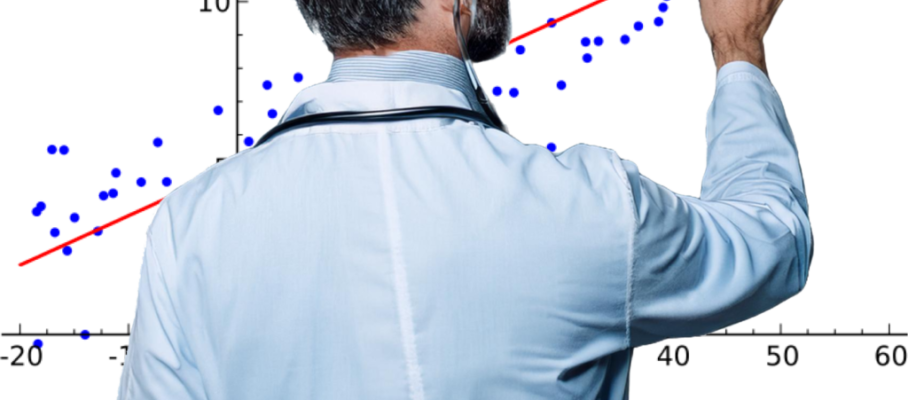
Whether your goal is to identify substitute characteristics or solve a process problem, regression algorithms can produce coefficients for almost any data. However, it doesn’t mean the resulting models are any good.
In machine learning, you divide your data into a training set on which you calculate coefficients and a testing set to check the model’s predictive ability. Testing concerns externally visible results and is not specific to regression.
Validation, on the other hand, is focused on the training set and involves using various regression-specific tools to detect inconsistencies with assumptions. For these purposes, we review methods provided by regression software.
In this post, we explore the meaning and the logic behind the tools provided for this purpose in linear simple and multiple regression in R, with the understanding that similar functions are available from other software and that similar tools exist for other forms of regression.
It is an attempt to clarify the meaning of these numbers and plots and help readers use them. They will be the judges of how successful it is.
The body of the post is about the application of these tools to an example dataset available from Kaggle, with about 30,000 data points. For the curious, some mathematical background is given in the appendix.
Many of the tools are developments from the last 40 years and, therefore, are not covered in the statistics literature from earlier decades.


Jun 25 2025
Update on Data Science versus Statistics
Based on the usage of the terms in the literature, I have concluded that statistics has been subsumed under data science. I view statistics as beginning with a dataset and ending with conclusions, while data science starts with sensors and transaction processing, and ends in data products for end users. Kelleher & Tierney’s Data Science views it the same way, and so do tool-specific references like Gromelund’s R for Data Science, or Zumel & Mount’s Practical Data Science with R.
Brad Efron and Trevor Hastie are two prominent statisticians with a different perspective. In the epilogue of their 2016 book, Computer Age Statistical Inference, they describe data science as a subset of statistics that emphasizes algorithms and empirical validation, while inferential statistics focuses on mathematical models and probability theory.
Efron and Hastie’s book is definitely about statistics, as it contains no discussion of data acquisition, cleaning, storage and retrieval, or visualization. I asked Brad Efron about it and he responded: “That definition of data science is fine for its general use in business and industry.” He and Hastie were looking at it from the perspective of researchers in the field.
Continue reading…
Share this:
Like this:
By Michel Baudin • Data science, Uncategorized • 0 • Tags: data science, math, statistics