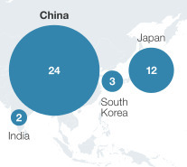
The bubbles above are intended to represent global market share by gross value added in 2010 in the manufacturing of “global goods for local markets,” which includes appliances, automotive, chemicals, and pharmaceuticals.
The complete chart (see below) is a map of the world with a bubble for each of the top ten countries. From the point of view of graphic art, the chart looks professional; as a means of presenting data, however, it misleads.

From the center of the bubbles, you can see that China’s share is twice that of Japan, but the bubble is four times larger. This is because its radius is twice that of Japan’s bubble.
This is a perfect example of Tufte’s rule that you should not us a two-dimensional symbol to show one-dimensional data. Market share is one number. If you want to make an accurate graphic comparison of different countries’ market shares, use a bar chart. It would look as follows:

As most readers know where in the world the US, China, and Japan are, you can lose the map of the world. It looks great, but it adds no information.
Aug 31 2013
Misleading Graphics in Global Manufacturing Report from McKinsey
See on Scoop.it – lean manufacturing
 “The global manufacturing sector has undergone a tumultuous decade: large developing economies leaped into the first tier of manufacturing nations, a severe recession choked off demand, and manufacturing employment fell at an accelerated rate in advanced economies. Still, manufacturing remains critically important to both the developing and the advanced world. In the former, it continues to provide a pathway from subsistence agriculture to rising incomes and living standards. In the latter, it remains a vital source of innovation and competitiveness, making outsized contributions to research and development, exports, and productivity growth. But the manufacturing sector has changed—bringing both opportunities and challenges—and neither business leaders nor policy makers can rely on old responses in the new manufacturing environment.”
The bubbles above are intended to represent global market share by gross value added in 2010 in the manufacturing of “global goods for local markets,” which includes appliances, automotive, chemicals, and pharmaceuticals.
The complete chart (see below) is a map of the world with a bubble for each of the top ten countries. From the point of view of graphic art, the chart looks professional; as a means of presenting data, however, it misleads.
From the center of the bubbles, you can see that China’s share is twice that of Japan, but the bubble is four times larger. This is because its radius is twice that of Japan’s bubble.
This is a perfect example of Tufte’s rule that you should not us a two-dimensional symbol to show one-dimensional data. Market share is one number. If you want to make an accurate graphic comparison of different countries’ market shares, use a bar chart. It would look as follows:
As most readers know where in the world the US, China, and Japan are, you can lose the map of the world. It looks great, but it adds no information.
See on www.mckinsey.com
Contents
Share this:
Like this:
Related
By Michel Baudin • Press clippings 0 • Tags: Chart Junk, Global Manufacturing, Global Market Share, McKinsey